Content accessibility: 5 common mistakes and a checklist for avoiding them
An accessible website is essential for anyone using assistive technology. But it benefits all users. Good accessibility is good usability. And content plays an important part in ensuring a website is accessible.
Content is just one element of a website’s accessibility. But it’s probably the part that you have the most control over. Some accessibility issues will need to be fixed by a designer (for example, the colour options that are available to you) or a developer (for example, whether the navigation can be accessed with a keyboard).
In this article, I’ll explain the most common issues that make website content inaccessible and share some examples of good content accessibility. At the end, there’s a checklist to keep you on track.
Complex language
We read differently online to the way we read in print. We’re often scanning content because we’re in a goal-orientated mode, looking for specific information. We’re more likely to be distracted too. Good use of language can help your users complete tasks quickly. For those who are dyslexic or cognitively impaired, simple language is essential. This means:
- use short sentences - the readability guidelines suggest an average length of 15 words
- write in plain English - use conversational language and write in an active voice
- use familiar words - uncommon or formal words slow readers down. It’s much easier to read ‘drink’ than ‘beverage’
- avoid jargon - this includes using acronyms or project names in your main website navigation
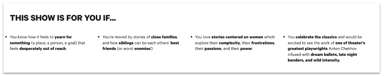
For arts venues, using simple language can be especially challenging when it comes to writing exhibition or show copy. Curators and creatives often claim artistic licence on their copy. Organisations with a research arm might argue that their audience prefers certain lofty language. It doesn’t matter what type of organisation you are, it’s been proven that even academics prefer clear, easy language. If you’re struggling to win folks over in your organisation, the next best thing is to give your audience an accessible alternative.
This excellent example from Two River Theater is an additional show description for Chekhov’s Three Sisters. It’s just 4 short bullet points about the play that’s written in an active voice (‘You’re moved by…’) and uses familiar language. But it goes a long way in opening up the story and themes of the play to someone who might be unfamiliar with Chekov.
Heading structure
A heading should describe the content that follows it, a bit like chapters of a book. When sighted users arrive at a new page, they gravitate to headings to quickly find the information they’re looking for. But headings aren’t just a visual device. They’re a structural one too.
There are six different heading ranks, from <h1> to <h6>, which a screen reader will use to interpret content hierarchy (how important information is on a page). Screen reader users can use headings to navigate between different sections of content on a page. If there are no headings on the page, a screen reader will read out every word of content. This frustrating experience means screen reader users will more likely be forced to rely on the help of sighted users to complete their task.
Incorrect use of headings is one of the most common content accessibility issues. The visual design of a page is often prioritised over the underlying structure. To make your content accessible you should:
- only use one
<h1>heading - this should be the page title - use headings hierarchically - after the page title use
<h2>level headings for sub-sections and<h3>for sub-sections within the<h2>section and so on - never skip headings - do not skip from a
<h2>to a<h4> - be careful about overusing the same level headings - they’re there to provide a hierarchy to the information on a page
- plan your heading structure before composing the page - don’t choose heading levels based on their appearance. Work out a logical information hierarchy before building the content out
Good heading structures can be hard to come by. If you want to learn from the best, examples like gov.uk or wikipedia are a good place to start. There are outliner tools that you can use to view the heading structure of a page. This page on the National History Museum’s website is a fairly good example of heading structure - but there’s still room for improvement.
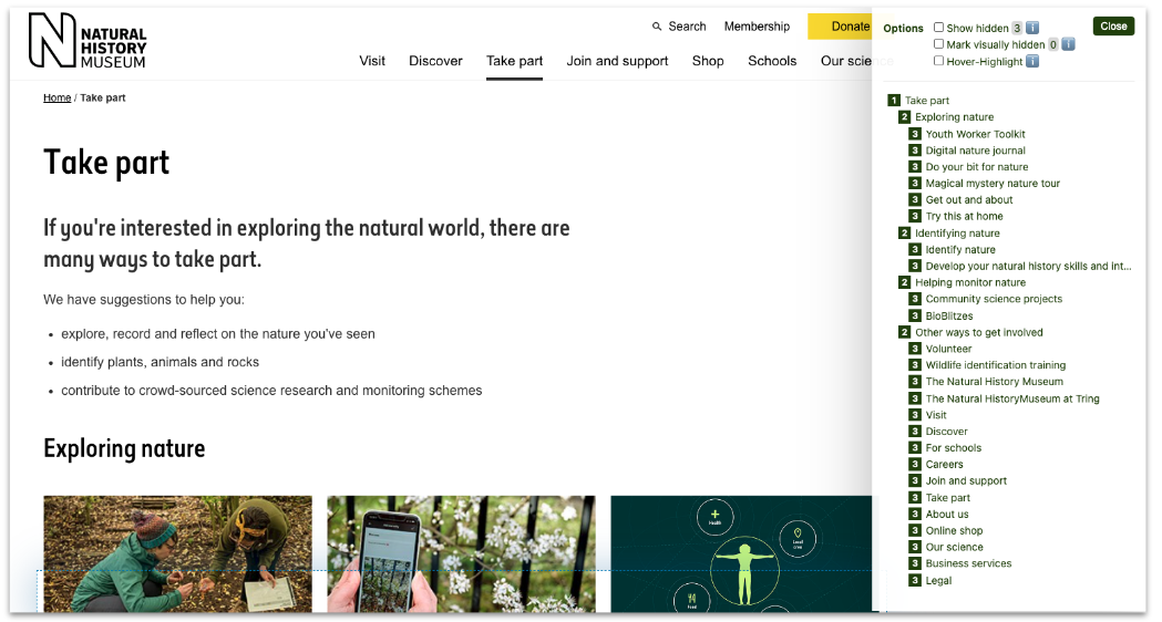
Headings are in a logical order, with no skipped heading levels. However, it looks like all the <h3> headings are of equal importance when the last 13 <h3> level items are actually links in the footer. Creating another <h2> heading with a ‘Footer’ title would be beneficial in this case.
Missing image alt-text
Alt-text is a written description of an image. It’s mainly aimed at screen reader users, but there are benefits for autistic people too. The alt-text tag was first introduced in 1995 when the internet was slow and images took a while to load. Awareness of alt-text has increased recently with Twitter and Instagram adding alt-text options to their platforms. The folks at NASA recently went viral with an alt-text description that almost added another dimension to the image.
But still, missing or poorly written alt-text is a common accessibility issue. Like with heading structures, publishers mainly focus on the visual appearance of a page, deprioritising the data that is necessary for screen readers.
You can check if a page has any missing image alt-text with web extensions but they won’t tell you anything about the quality of your alt-text. There are various opinions about approaches to writing alt-text but here are some of the points experts generally agree on:
- write in the present tense - using clear language and short sentences
- focus on the purpose of the image - Max Kolher has written an excellent article about this
- write what you see - but be sensitive to what you may not know (e.g. around ethnicity, gender, sexuality)
- consider if there’s an emotional context - this example of alt-text is brilliant at getting across a feeling, as well as a visual description
- don’t start with “image of” - screen reading software will cover this off
- don’t add alt-text to decorative images - typically, these are images that don’t offer additional information to the content. Instead, insert two speech marks “” into the alt-text field.
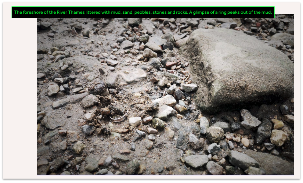
This alt-text from a blogpost on The Globe’s website is a great example of applying the above approach. The alt-text successfully provides a straightforward description of the scene as well as conveying a sense of excitement. Words like ‘gimpse’ and ‘peeks’ elevate the description into a storytelling world. This is important from an accessibility perspective - just as an image acts as a stimulus for the imagination of a sighted user, so too can language for a screen reader user.
PDFs
At our latest Digital Works event on accessibility, content designer and disability blogger Chloe Tear made the case loud and clear. PDFs are not accessible. Not even tagged ones.
There are very few plausible excuses for providing users with a PDF-first content experience. Season brochures designed for print? The content probably already exists on the website. Programme notes for a concert? Build them in HTML. The fact that content is essentially ‘locked in’ to a document means that Google is less aware of it when it crawls your site for SEO purposes. It also means the content takes more work to update if needed (possibly involving a designer or at the very least version control).
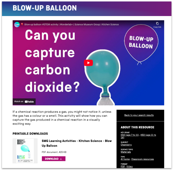
If you do think there’s a plausible use case for offering content in PDF format, make sure it's built out in HTML first. This Science Museum’s Learning Resource is a good example of an accessible content experience. The resource is provided as a video (with hardcoded subtitles), in HTML format (with headings) and as a PDF for print. We’ve written more about ways you can make pdfs and other ‘print style’ content accessible.
Link text
As well as being able to navigate between headings, screen readers can also read out a list of links on a page. This means that the link text should:
- make sense out of context
- describe the action or destination
- be specific and unique from different links on the page
- avoid being anything undescriptive like ‘click here’, ‘more’ or ‘read more’
- avoid being a written out URL
Watch this video to understand how screen readers read out links
There are tools such as the ‘search links’ bookmarklet that collate all the links on a page into a list (drag and drop the bookmarklet to your bookmarks bar and use it on any web page). These tools are an excellent way to check that your links make sense out of context once you’ve published your page.
Content accessibility doesn’t stop here. There are plenty more content considerations, from video subtitling to the visual presentation of content. It’s worth remembering that technology is constantly changing, so accessibility should always be an ongoing conversation.
We’ve collated the points above (and a few extras) into this handy content accessibility checklist to help keep you on track.
If you have any questions or would like to have a chat about making your content more accessible, just get in touch.